The Design Brief
In ART 254, a design course I took during the spring of my Sophomore year, I was to design mockups for both an app and website which related to an existing museum. The purpose of this assignment was to design for connections, using technology to not only bring people together, but also connect them more closely with an exhibit or artifact in a particular museum.
The Museum
There was a wide range of museums to choose from, but the one that I selected for this specific project was The Field Museum in Chicago, Illinois. This was a museum I had visited during a college visit in High School, and I had fallen in love with it almost instantly. The long halls of fossil displays, giant skeletal mounts, and multitude of taxidermized specimens truly made me feel at one with the natural world, and it was a feeling that I’ve cherished ever since my first visit.
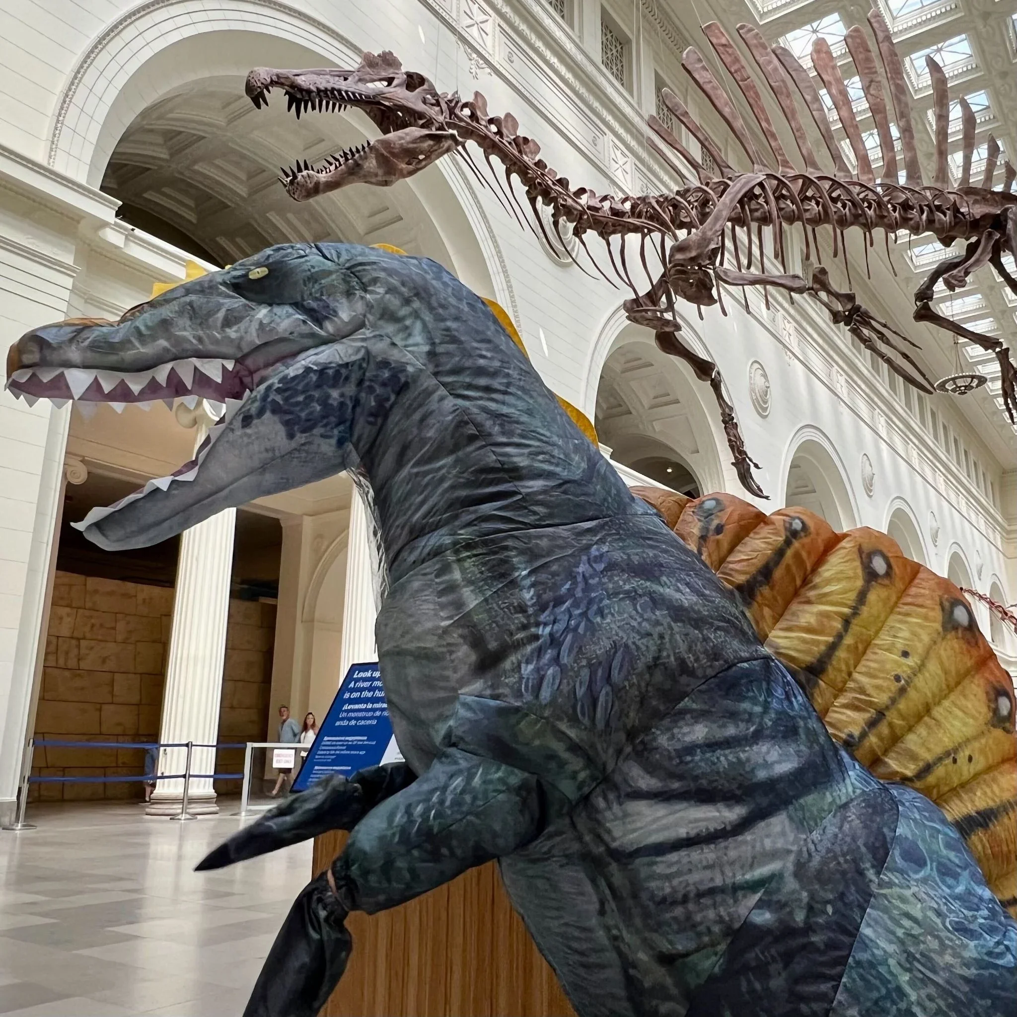
To replicate this feeling, I wanted my website and app designs to create a similar sense of connection to the museum’s artifacts and exhibits. At the time, a new skeletal mount of a Spinosaurus named Sobek had been put on display at the museum, and with my pre-existing fascination with dinosaurs, I began conceptualizing a supplemental app/website centered not just around this particular dinosaur, but the entire ecosystem from which it would have lived 95 million years ago. Therefore, the idea of a hypothetical exhibit, The Bahariya Safari (named after the Bahariya fossil formation in Egypt) was born.
The Research
In order to create a hypothetical museum exhibit about Sobek’s ecosystem, I would have to extensive research on the Bahariya Fossil Formation in Egypt. The fossils at this site date back to the Late Cretaceous, roughly 95 million years ago. The environment would have been a coastal wetland, characterized by mangrove swamps and river systems that supported a wide range of fish, reptiles, and of course, dinosaurs. Creating interactable materials for this exhibit would be an interesting educational endeavor, as it showcased just how different familiar environments were during prehistoric eras.
When I began to develop my materials, I wanted to challenge myself by targeting children as my target demographic. Kids love dinosaurs, and they also love learning, so my materials would have to be able to appeal to their sensibilities in a way that would stimulate their young minds. I developed a persona for a child who served as the model for how I would design my materials.
The Bahariya Safari would serve as an educational outlet, exploring this unique prehistoric ecosystem in a novel way. Both my website and app would have to be not only educational, but also fun and engaging.

The Look and Feel
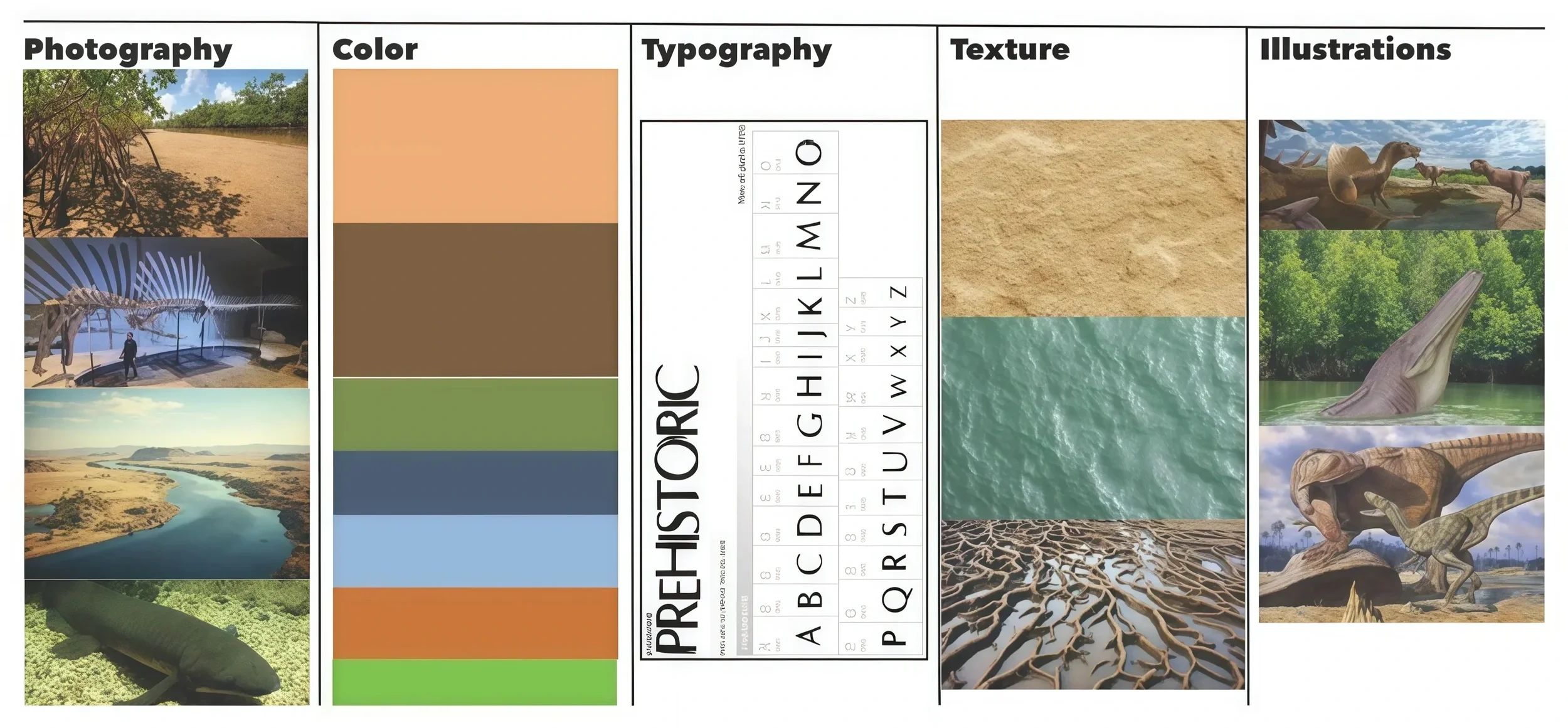
For the visual design of my materials, I wanted them to be as immersive as possible for the exhibit. I envisioned The Bahariya Safari exhibit as being something that immerses museum patrons into the Cretaceous period, complete with fake plants, humidifiers, and a unique prehistoric soundscape. In order to compliment this, I wanted all of the visual elements of my website and app to follow suit.
The colors and textures chosen were appropriately earthy, being evocative of sand, clay, vegetation, and coastal water. Furthermore, the imagery should maintain this theme with illustrations of Bahariya fauna, and plenty of landscape photography to properly sell the theme of the exhibit.
The Typography
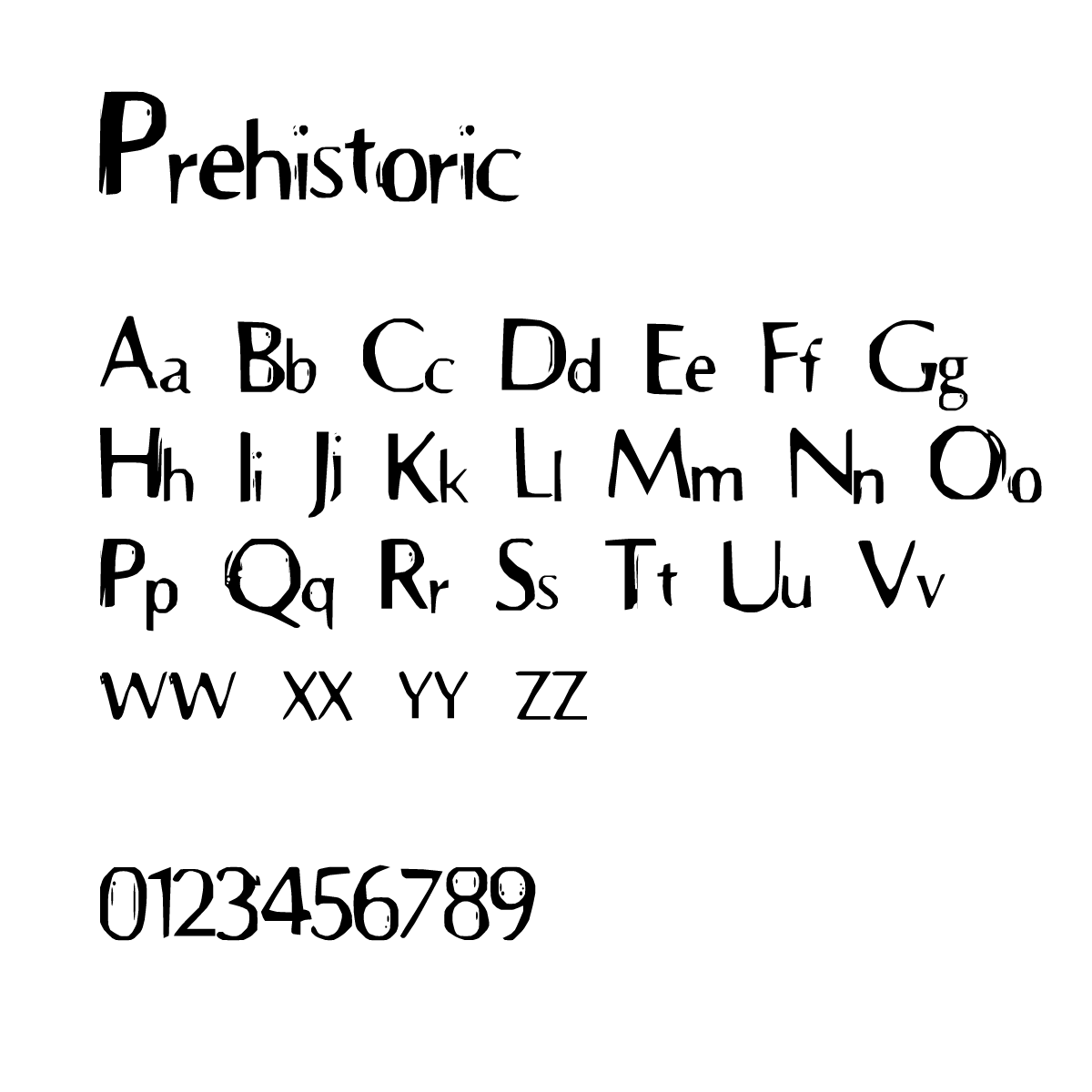
For the display typeface, the Prehistoric font was, unsurprisingly, a perfect fit for The Bahariya Safari. The worn edges rough texture perfectly communicated something primal and wild, yet it was still legible for headers and other forms of display. This typeface would also become a pivotal part of the logomark for the exhibit as well.
The Logo
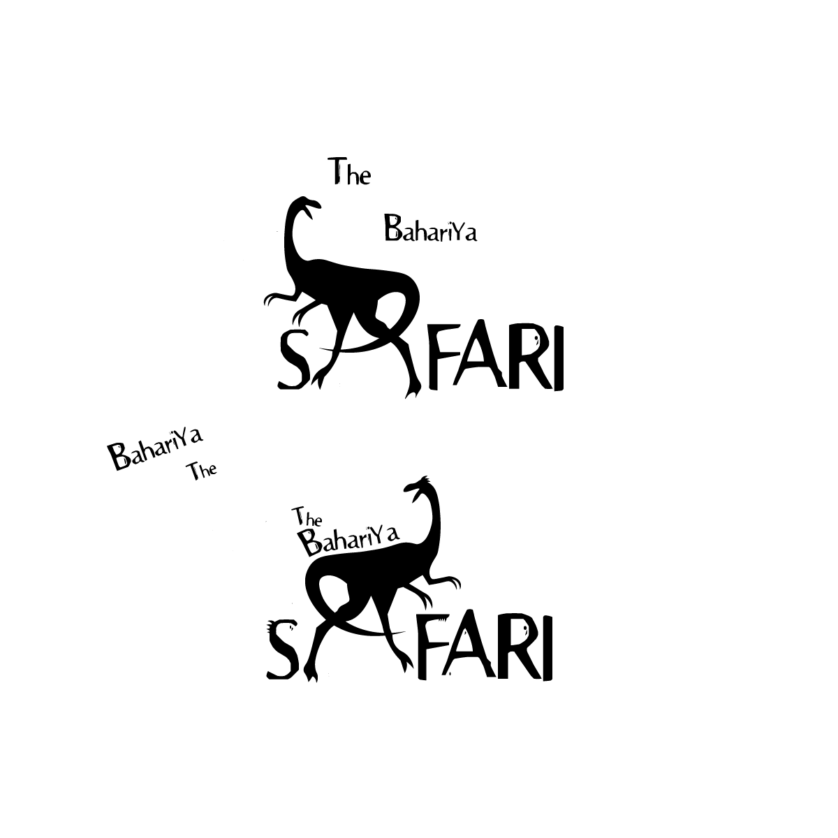
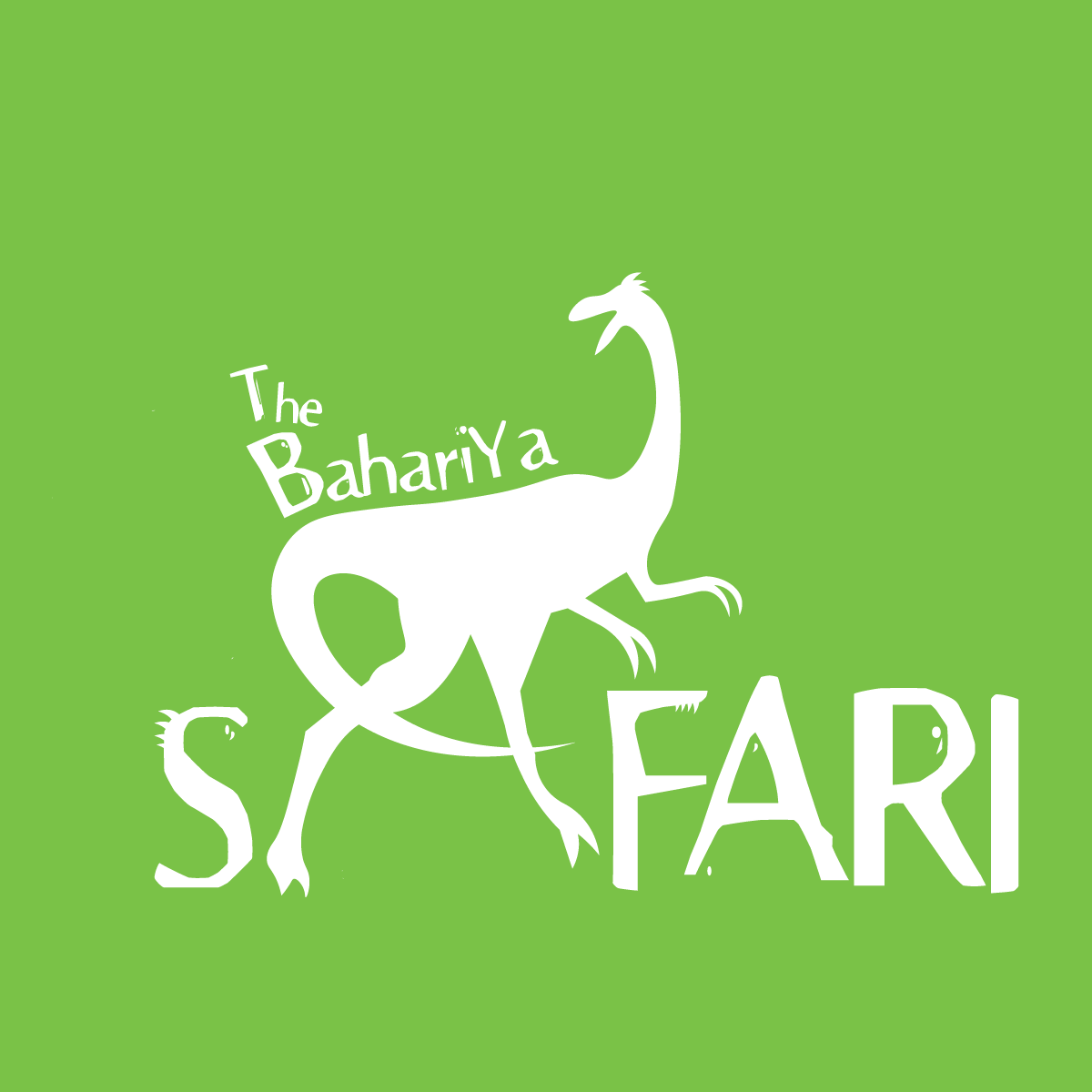
I would need a logo for my materials, and utilizing some form of dinosaur imagery seemed like an obvious necessity for subject matter at hand. The silhouette of a theropod dinosaur seemed obvious for the logo, but the matter of it’s placement in relation to the lettermark was a little more difficult to establish. The motivation behind the project was connectivity, and so it made the most sense for the dinosaur to be a part of the title, and have both elements play into one another visually.
The idea to have the dinosaur’s tail and legs form the A in safari came to me, and when executed ended up coming together wonderfully alongside the prehistoric typeface. The words The Bahariya also follow the curve of the dinosaur’s back, which further aids in the connectivity of the type and the icon.
In my initial iterations, the dinosaur’s silhouette was anatomically very smooth, and so some added spikes atop its head added a nice bit of visual flair that I felt had been missing. A corresponding set of spikes on the S would also create a good bit of synergy with the dinosaur, and so the final logo was created with these elements complimenting one another.
The App
Using Figma to develop the app prototype, the focus would be on the incorporation of activities for museum patrons to engage with. The assignment brief stated that at least two functional activities would have to be present on the app, and so I decided to focus on fostering connection between people for one of these activities.
One of these activities, titled “Expedition Team”, is an activity wherein multiple users of the app would be assembled into a group, and then tasked on a sort of scavenger hunt to find a certain number of species within the exhibit. This activity is intended to foster connections between museum patrons, grouping likeminded individuals into a collaborative social activity via the app. The Figma prototype features a bestiary and a functional example as to how completing one of these tasks would work.
The other activity, which was titled “Who Eats Who”, was more asocial, but simultaneously more educational. In this activity, users would be able to scan QR codes on certain display plaques of species within the exhibit, and then put said species into a food chain which they would build throughout their time in the exhibit. This activity was intended to create a greater level of engagement with the educational aspects of the exhibit, teaching the user more about ecology and predator-prey dynamics in nature.
The prototype features a usable sample of how the activity would work, including a camera to scan a QR code, unique species bios, and a glossary of terms for assistance.
The Website
Whereas the app centered around activities that a museum patron would engage with while present in the exhibit, the website would instead serve as a supplemental material for users to engage with at home. The website was designed to showcase and advertise The Bahriya Safari website, designed to emulate the same brand standards utilized by Chicago’s Field Museum. By extension, I included an activity with the intent of forging a stronger connection between the user and the star artifact of the museum: Sobek the Spinosaurus.
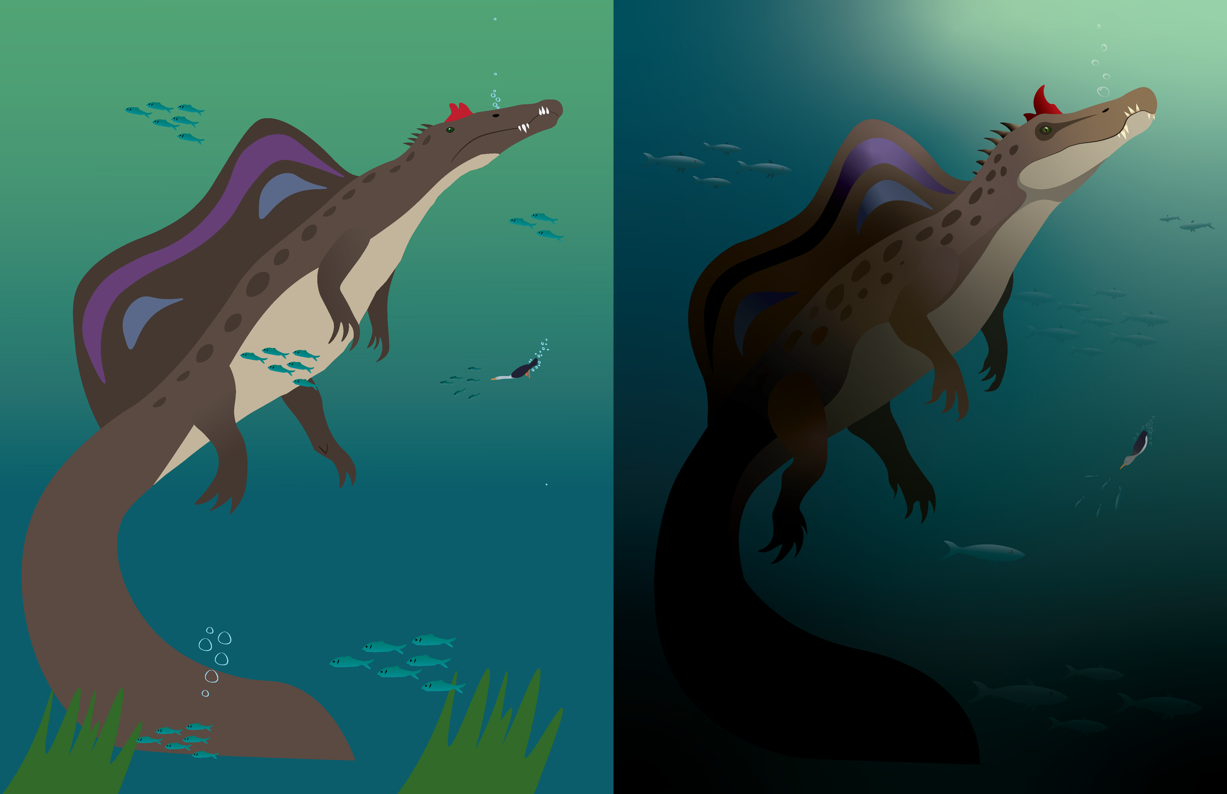
Sobek’s Story is a short, four-page storybook centered around the life cycle and life history of Sobek, from a newborn hatchling, to a curious juvenile, growing into a dominant adult, and then progressing into a languishing elder. Each of the four life scenes were illustrated by me within Adobe Illustrator, and then moved into the website prototype on Figma.
The purpose of this storybook would be to take an extinct animal and display it in a sympathetic, relatable way. For many people, dinosaurs are an abstract concept, as it is hard to imagine the living, breathing animals that the fossils and skeletons once belonged to. This storybook would showcase the life history of a dinosaur in such a way to help form a connection with the animal, in a way that likely would not have been entirely possible from just a museum display.
The Revitalization
In ART 451, the class I took during the Fall of my Senior Year, I was given the opportunity to revitalize an old project. Looking back on the original illustrations that I did for Sobek’s Story my Sophomore year, I quickly realized that I had significantly developed my craft as an artist, and so I was determined to redo them, and breathe new life into this project.
Revisiting the old portraits, I quickly noticed a distinctive lack of light, shading, volume, and environmental detail. I wanted to maintain the core compositions, colors, and energy of each piece, but give them a much-needed face lift. The end result ended up being incredibly satisfying to look at, and far more impactful than the original illustrations that I created during my sophomore year.
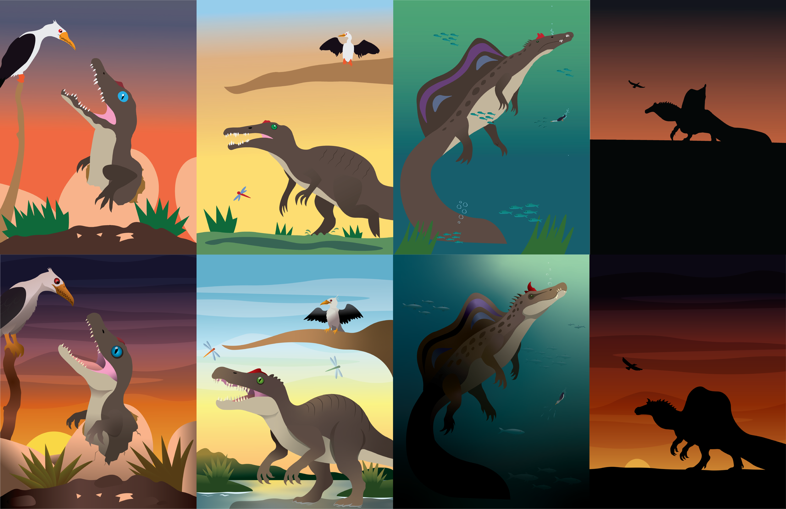
A comparison between my old (top) and new (bottom) illustrations for Sobek’s story.
The Reflection
The Bahariya Safari was as much a passion project as it was a school assignment. This project pushed my creative limits, as it was not only my first ever endeavor into Figma, but also my first attempt at any form of branding or UX/UI design. Dinosaurs are one of my greatest fascinations, and so being able to work on a project about them and the lives they lived proved to be a highly enriching experience, and the final result is a set of prototypes that I could truly be proud of.
Revisiting this project with a more seasoned set of eyes proved to be incredibly enlightening. Taking my older illustrations and bringing them to my current artistic standard was a joy, as it allowed me to recognize my own improvements as an artist, and also breathe life into a piece that my younger self was very fond of. I believe that this project was an important milestone for my development as both a designer and storyteller, and laid an important precedent for my creative workflow moving forward.