The Design Brief
During my Junior Year at Miami University, the professor of my ART 352 course assigned us a semester-long project. This intensive project would be to take an animal of our choosing, and turn it into a logomark for a hypothetical brand. This brand would then have to be fleshed out with a full standards guide, complete with typography, color, directions for use, and mockups.
The Animal
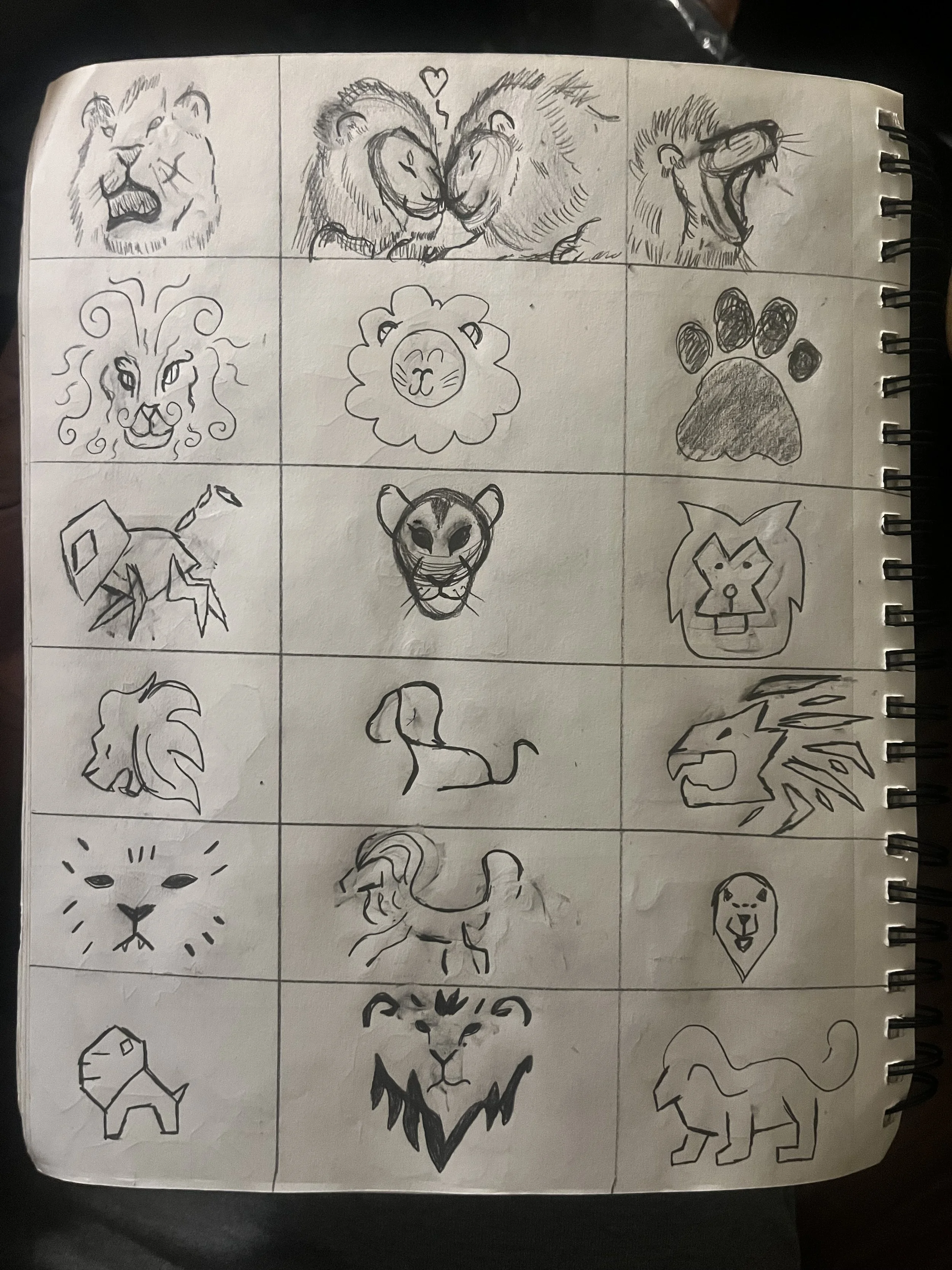
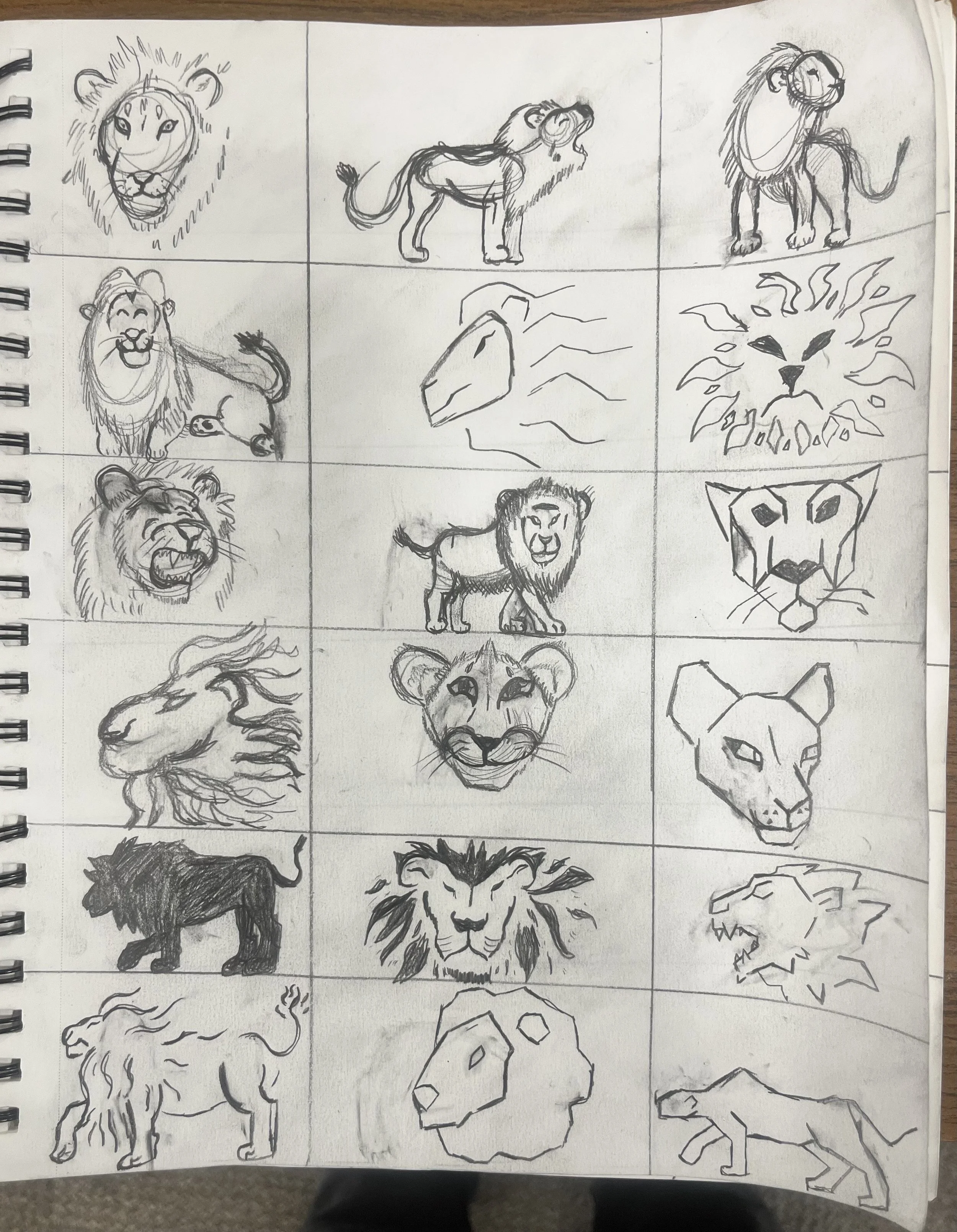
Before a brand concept had yet been established, I first selected my animal and began doing a series of thumbnail sketches for logo ideas. The animal I chose was a lion, a symbol of nature that is both enigmatic and potentially cliche. In many cultures, lions represent pride, regality, and prestige, but I wanted to experiment with my sketches to produce logo sketches that explore all facets of lion anatomy, personality, and form. These sketches explore a range of different art styles and interpretations of lions, and I wanted each sketch to evoke a different “feel”: some are more sharp and intense, others more soft and intimate, and some zany and subversive. These sketches allowed me to exhaust the full breadth of what makes a lion, a lion, and helped better inform the kind of brand I wanted to make.

The Brand Concept
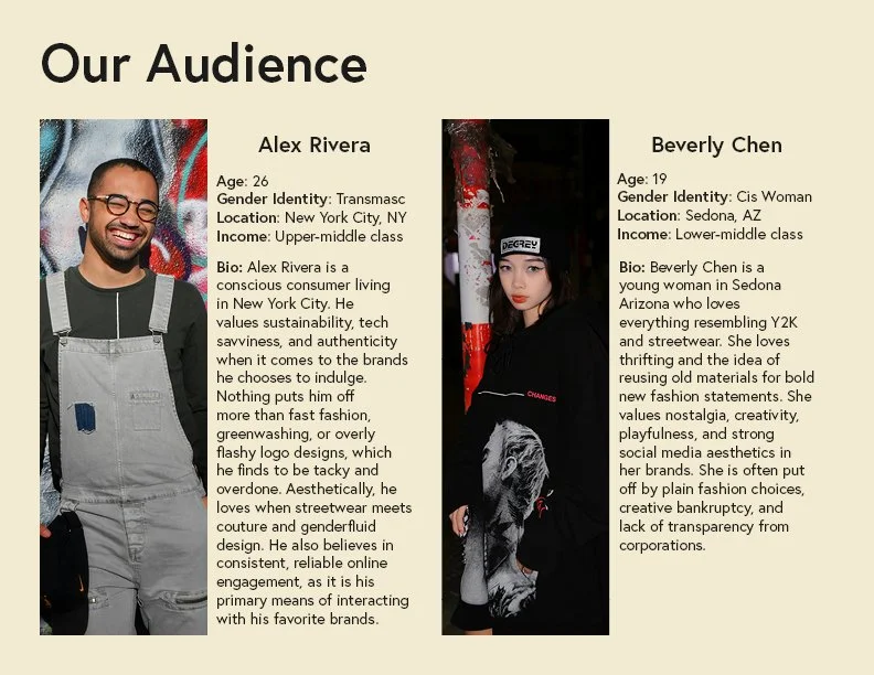
After the phase of coming up with sketches, there came the establishment of what my brand would actually be. I wanted to design a brand that complimented the animal it was based on, but was also subversive. Lions often represent pride and prestige, but they are also the only social big cat, living in groups and having a strong, tight-knit community. Therefore, the idea for a luxury fashion brand came about, but one that centralizes inclusivity, sustainability, and accessibility in it’s clientele. The brand would subvert the previously established rules of luxury fashion, focusing more on bringing people together rather than excluding them based on class or income. My primary target demographic for the brand would be a combination of young millennials and older gen Z, the two demographics who hold the majority of the market value for designer brands.
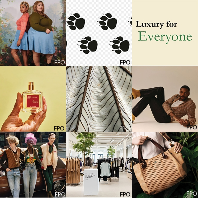
The rough branding squares to the right are meant to symbolize the visual and tonal identity of what the brand would be. I visualized the brand as being light, diverse, and with ties to nature. The brand should communicate prestige and luxury while also being welcoming. This would be an interesting paradox to tackle moving forward.
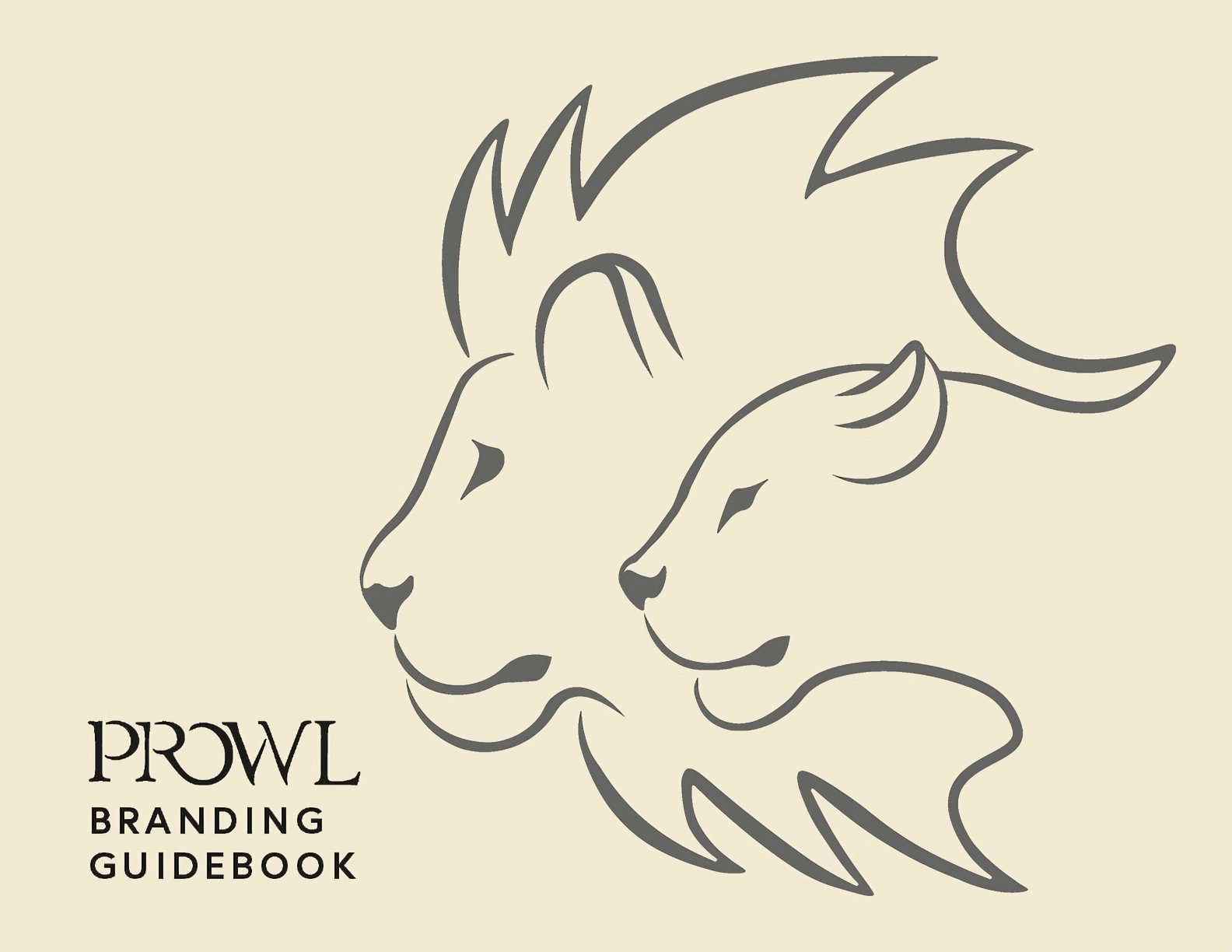
The Logo and Name
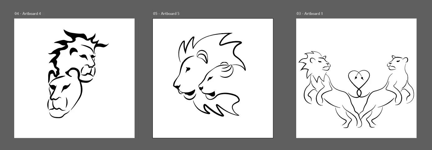
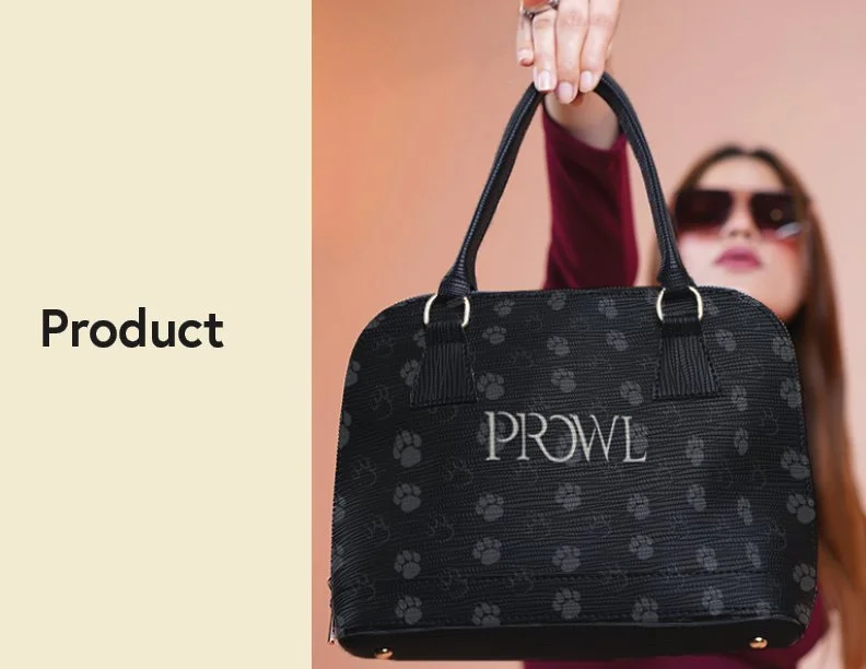
One core principle buzzed in the back of my mind when it came to developing my finalized logomark: connectivity. My fashion brand was all about creating community, and so I wanted a logo that visually reflected that idea. Because of that, I decided to include not just one, but two lions: specifically a lion and lioness, as to represent the duality of lion social structure, as well as equitable gender representation for my brand.
Following this theme, I would go on to produce a couple iterations within Adobe Illustrator for potential logos, featuring a lion and lioness intertwined in some way. Eventually, I became attached to the visage of both lions being showcased in profile, with the two having intertwined linework and the lioness being formed from the mane of the lion.
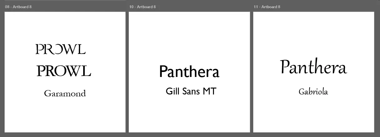
Once the logo concept was settled, there came the task of naming my brand. I wanted something short and punchy, yet with a thin layer of prestige to communicate high fashion. I had initially been drawn to the name Panthera, which is the first half of the scientific name for lions: Panthera leo. However, I found that there was a dissonance caused by this name, as people were confused why a brand called Panthera has lions as a logo instead of panthers.
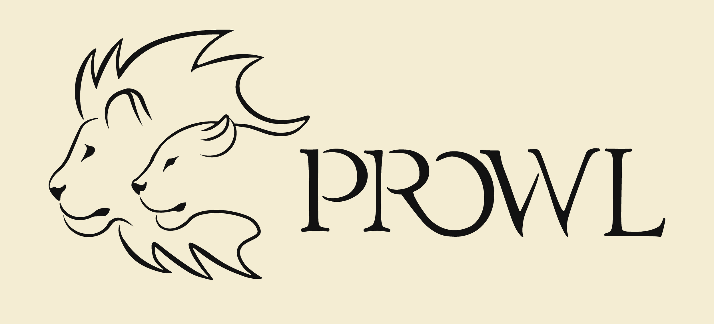
In light of this feedback, I went back to trying to find a proper name for the brand, one that was succinct yet distinctive. That’s when I came up with the name Prowl. It was a name that communicated mystique, intrigue, and just a hint of ferocity, all great elements of a fashion brand, and furthermore it matched the leonine aesthetic I was going for. With the name and logo solidified, I went on to finalize a logomark for the brand.
Color and Typography
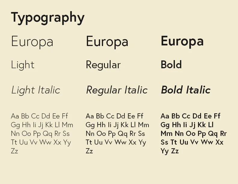
In order to present my brand formally, I would need to settle on primary colors and a typeface. For my typeface, I appreciated the flowing curves and the serifs on Garamond, as I feel it communicated a degree of luxury and high fashion. This would be the typeface utilized for Prowl’s lettermark, albeit modified slightly to create a more unique look. As for general brand usage, I enjoyed the clean, simple look of Europa, as I felt it looked polished but also approachable, which was a perfect fit for the overall brand.
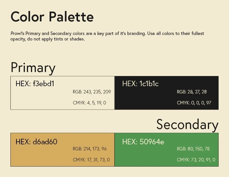
Color was an interesting arena to tackle, as most clothing brands only associate themselves with two colors or less. In the realm of fashion branding, the clothes and style often speak louder than the colors used to present them. As a result, I decided to keep color usage to a minimum. In lieu of white, an off-white “cream” color would be used, as well as a dark gray as opposed to black. These two primary colors take a typical color combination, and subvert them slightly. The stark coldness typically associated with black and white was instead transformed into a much more approachable and warm color palette.
As for secondary colors, I wanted to reflect both prestige and sustainability, and so a muted gold and green were chosen as accenting colors within the brand’s overall presentation.
The Brand Book
With the elements assembled for the brand, there came the herculean task of building out a full set of brand guidelines, which would require me to flesh out how the brand presents itself in a professional context, as well as how all of the elements I created were to be utilized in said context.
This multi-week task incorporated a great deal of iteration and research. Data I had gathered from multiple online sources showed that for younger generations, frustrations with high fashion brands often stemmed from a lack of accessibility, inauthenticity in brand communication. With this in mind, I knew that in order to reach my target audience, Prowl would have to subvert all of these complaints in how the brand communicated. As a result, with my community-building theme in mind, I ensured that Prowl was a brand that focused on inclusive language and brand transparency, as to showcase its dedication to clear, no-nonsense communication. Furthermore, the brand was to never refer to its clientele as “customers” or “consumers”, but rather a “community.” This inclusive language would ensure that Prowl was more than a brand, but rather a sort of social movement, one which any could feel welcome taking a part in.
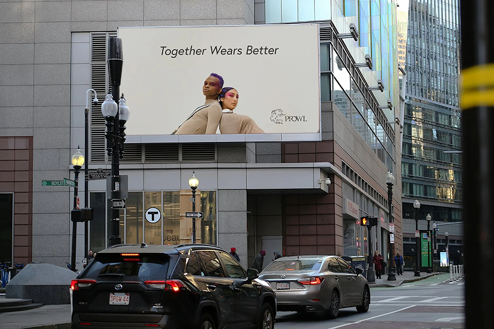
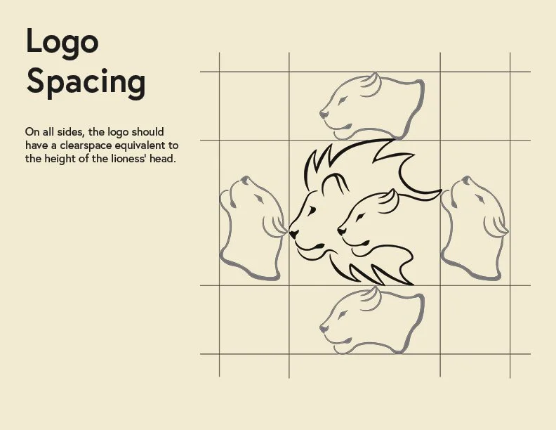
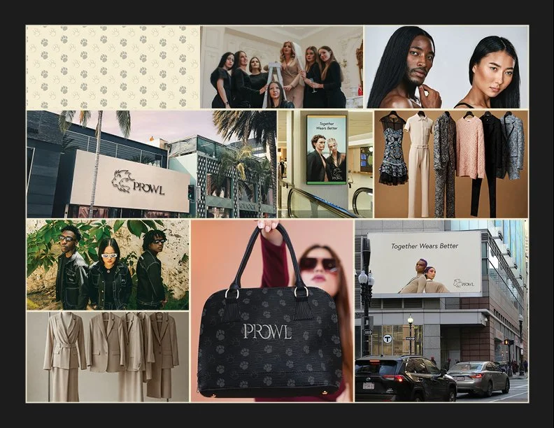
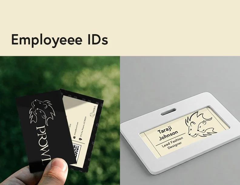
Furthermore, all of the technical aspects of my brand were established, such as logo clear space, color usage, and the dos and don’ts of how the brand was to be showcased. By extension, I created a brand pattern, personas, and a series of mockups to show the brand in action, including multiple ads and employee identification. These mockups helped to better “sell” the idea of Prowl as a real fashion brand, and I a combination Adobe Photoshop, Indesign, and Figma for this proccess.
The full Prowl Brand Book is viewable here

The Reflection
The creation of Prowl was a months-long process that stretched my limitations creatively and intellectually. However, I ultimately found it to be a highly enriching experience in terms of brand development and communication. By enduring this project, I expanded my design horizons beyond just aesthetics, as I had the task of looking at every aspect of what makes a brand work. Creating Prowl forced me to do an intensive amount of research into market trends, consumer wants, and brand necessities in order to create a functional, believable brand.
The final brand is a shining star within my body of work, as it showcases not only artistic capability, but also capabilities within the realm of critical thinking and brand communication. I feel that this project pushed me further as a designer, and cemented my own personal belief that design is a powerful tool, one which I wield with a greater sense of pride due to the successful generation of Prowl.